Customizing colour for web experiences
What problem are we solving?
Just like with a business as large as Stripe, Cryptlex has web applications that are business-facing and web applications that are meant to be accessed by the customers of those businesses. In other words, Cryptlex is a B2B2C SaaS which helps software companies sell their software on their terms, which are defined by Licenses (you can think of these as subscriptions).
Cryptlex’s customers want the web applications facing their customers to be customized which is also known as white-labeling.
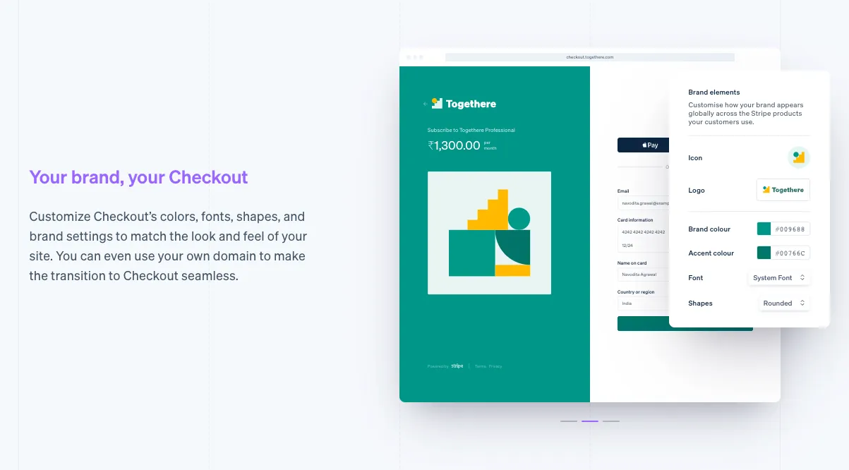
Stripe Checkout is a similar web application that is customer facing. It showcases the customization with the tagline “Your brand, your Checkout”.
What alternatives did we consider?
After evaluating customer requirements and the available market solutions, we could narrow our alternatives down to the following:
Allow customers to create their own components for building a web experience for their customers
While this is already possible through the REST API, most of our customers sell desktop software and are not well-versed with web technologies, and are unlikely to have their own design systems or UI libraries.
This implies that we will have to find/build a low-code solution like Retool to allow our customers to build their components with great flexibility. We did not explore this further due to the high effort and low confidence of the initiative.
Allow customers to set a colour palette for our components
We gathered that most, if not all our customers would be able to set a colour palette for us to mirror their visual identity to some extent. This is a common pattern that we noticed in similar businesses like Paddle. However, this approach can cause serious usability issues and requires our customers to do a fair share of visual testing because our components are built on interaction rules that might not work for all colours and could cause serious accessibility issues.
Allow customers to set an OKLCH hue for our components
While setting a colour palette provides more flexibility, as mentioned above, it can also cause accessibility issues. I had recently found out about the growing browser support for OKLCH and the predictable lightness that it supports which would be perfect for a use case such as this. It would prevent accessibility issues while however compromising on the perceived hue.
Using OKLCH looked straight-forward and it seemed that it would allow building a preview of the colour change in a relatively simple manner.
How are we solving this issue?
Since the OKLCH solution, in theory, required the lowest effort, I decided to build a proof of concept for the same.
I mentioned in a previous post that the developers at Cryptlex wanted to continue using Angular2, and the only mature UI library we could build on top of in that ecosystem is Angular Material. While allowing users to pick their logo is straight-forward, setting their own colours is not as simple.
The Angular documentation website has a ‘theme’ switching mechanism that swaps out multiple bundles of CSS to switch themes. All of these bundles contain the same rules with a different set of colours set using a SCSS map at compile time. This approach has no regard for performance.
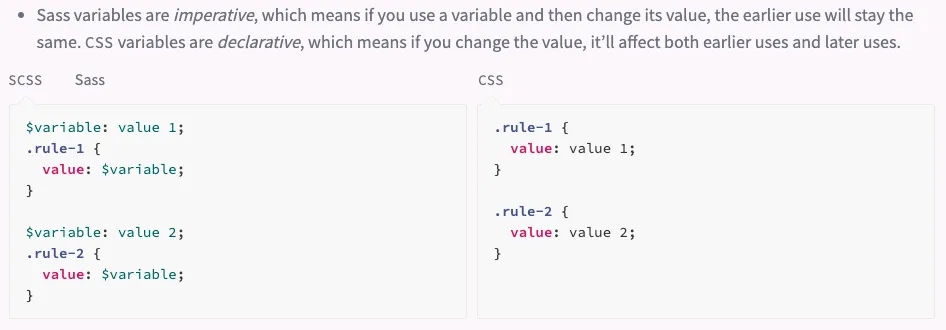
Sass-Lang Documentation
Adam Argyle shows a modern and performant approach to generating colour palettes in a web application with OKLCH, that I found to be perfect for the use case. However, I had to confirm if I could make it work with Angular Material.
/// Generates an OKLCH palette in CSS variables for a given name and hue.
@mixin generate-variables-for-hue($name, $value) {
  --#{$name}-hue: #{$value};

// Generate palette swatches
--x#{$name}-swatch-1: oklch(0.99 0.02 var(--#{$name}-hue));
--x#{$name}-swatch-2: oklch(0.97 0.03 var(--#{$name}-hue));
--x#{$name}-swatch-3: oklch(0.9 0.04 var(--#{$name}-hue));
--x#{$name}-swatch-4: oklch(0.72 0.13 var(--#{$name}-hue));
--x#{$name}-swatch-5: oklch(0.67 0.13 var(--#{$name}-hue));
--x#{$name}-swatch-6: oklch(0.5 0.13 var(--#{$name}-hue));
--x#{$name}-swatch-7: oklch(0.35 0.13 var(--#{$name}-hue));
--x#{$name}-swatch-8: oklch(0.25 0.13 var(--#{$name}-hue));
--x#{$name}-swatch-9: oklch(0.13 0.13 var(--#{$name}-hue));
--x#{$name}-swatch-10: oklch(0.05 0.13 var(--#{$name}-hue));

// Reference to palette swatches. Required for dark mode switch.
--#{$name}-swatch-1: var(--x#{$name}-swatch-1);
--#{$name}-swatch-2: var(--x#{$name}-swatch-2);
--#{$name}-swatch-3: var(--x#{$name}-swatch-3);
--#{$name}-swatch-4: var(--x#{$name}-swatch-4);
--#{$name}-swatch-5: var(--x#{$name}-swatch-5);
--#{$name}-swatch-6: var(--x#{$name}-swatch-6);
--#{$name}-swatch-7: var(--x#{$name}-swatch-7);
--#{$name}-swatch-8: var(--x#{$name}-swatch-8);
--#{$name}-swatch-9: var(--x#{$name}-swatch-9);
--#{$name}-swatch-10: var(--x#{$name}-swatch-10);
}

/// Swap Swatch 1 & Swatch 10, Swatch 2 and Swatch 9, and so on.
@mixin generate-dark-mode($name) {
  --#{$name}-swatch-1: var(--x#{$name}-swatch-10);
  --#{$name}-swatch-2: var(--x#{$name}-swatch-9);
  --#{$name}-swatch-3: var(--x#{$name}-swatch-8);
  --#{$name}-swatch-4: var(--x#{$name}-swatch-7);
  --#{$name}-swatch-5: var(--x#{$name}-swatch-6);
  --#{$name}-swatch-6: var(--x#{$name}-swatch-5);
  --#{$name}-swatch-7: var(--x#{$name}-swatch-4);
  --#{$name}-swatch-8: var(--x#{$name}-swatch-3);
  --#{$name}-swatch-9: var(--x#{$name}-swatch-2);
  --#{$name}-swatch-10: var(--x#{$name}-swatch-1);
}
Thanks to Adam and his instructions, the above code for generating a colour palette is straight forward. Now, Angular Material should use values from generated palettes for this approach to be used. Angular Material determines colour from a Sass map created by the mat.define-light-theme($theme) or mat.define-dark-theme($theme).
@use '@angular/material' as mat;

@include mat.core();

$my-primary: mat.define-palette(mat.$indigo-palette, 500);
$my-accent: mat.define-palette(mat.$pink-palette, A200, A100, A400);

$my-theme: mat.define-light-theme((
 color: (
   primary: $my-primary,
   accent: $my-accent,
 ),
 typography: mat.define-typography-config(),
 density: 0,
));

@include mat.all-component-themes($my-theme);
The approach recommended by the Angular Material documentation gives no control over how the background and foreground colours are set, something I was highly interested in. By studying the map generated by mat.define-#-theme(), I found the schema of the map so I could create it on my own.
/// Generates a colour map for Angular Material theme using CSS variables
/// WARNING: This colour map has not been extensively tested for contrast and accessibility.
@function generate-material-color-map($prefix) {
  $color-map: (
    50: var(--#{$prefix}-swatch-1),
    100: var(--#{$prefix}-swatch-2),
    200: var(--#{$prefix}-swatch-3),
    300: var(--#{$prefix}-swatch-4),
    400: var(--#{$prefix}-swatch-5),
    500: var(--#{$prefix}-swatch-6),
    600: var(--#{$prefix}-swatch-7),
    700: var(--#{$prefix}-swatch-8),
    800: var(--#{$prefix}-swatch-9),
    900: var(--#{$prefix}-swatch-10),
    default: var(--#{$prefix}-swatch-6),
    lighter: var(--#{$prefix}-swatch-3),
    darker: var(--#{$prefix}-swatch-9),
    text: var(--text),
    default-contrast: var(--#{$prefix}-swatch-9),
    lighter-contrast: var(--#{$prefix}-swatch-9),
    darker-contrast: var(--#{$prefix}-swatch-2),
    '50-contrast': var(--#{$prefix}-swatch-9),
    '100-contrast': var(--#{$prefix}-swatch-9),
    '200-contrast': var(--#{$prefix}-swatch-9),
    '300-contrast': var(--#{$prefix}-swatch-9),
    '400-contrast': var(--#{$prefix}-swatch-9),
    '500-contrast': var(--#{$prefix}-swatch-2),
    '600-contrast': var(--#{$prefix}-swatch-2),
    '700-contrast': var(--#{$prefix}-swatch-2),
    '800-contrast': var(--#{$prefix}-swatch-2),
    '900-contrast': var(--#{$prefix}-swatch-2),
  );

  @return $color-map;
}
By the looks of it, a lot of the properties in the map are present to prevent breaking changes.
$primary-colors: generate-material-color-map(primary);
$accent-colors: generate-material-color-map(accent);
$warn-colors: generate-material-color-map(warn);

$base-color-map: (
  primary: $primary-colors,
  accent: $accent-colors,
  warn: $warn-colors,
  foreground: (
    base: var(--text),
    divider: var(--divider),
    dividers: var(--divider),
    disabled: var(--disabled),
    disabled-button: var(--disabled),
    disabled-text: var(--disabled),
    elevation: var(--elevation),
    hint-text: var(--muted-text),
    secondary-text: var(--muted-text),
    icon: var(--muted-text),
    icons: var(--muted-text),
    text: var(--text),
    slider-min: var(--primary-swatch-6),
    slider-off: var(--disabled),
    slider-off-active: var(--disabled),
  ),
  background: (
    status-bar: var(--card),
    app-bar: var(--card),
    background: var(--background),
    hover: var(--hover),
    card: var(--card),
    dialog: var(--card),
    disabled-button: var(--disabled),
    raised-button: var(--primary-swatch-6),
    focused-button: var(--primary-swatch-6),
    selected-button: var(--primary-swatch-6),
    selected-disabled-button: var(--disabled),
    disabled-button-toggle: var(--disabled),
    unselected-chip: var(--disabled),
    disabled-list-option: var(--disabled),
    tooltip: var(--accent-swatch-5),
  ),
);
Since Angular Material’s Cryptlex Theme has a $is-dark property, based on which a lot of hardcoded colors like shadows and input field borders are set, I was forced to create a base map which I would then use to create a complete map with the $is-dark property.
// Have to generate two maps with is-dark true and is-dark false because Angular Material hardcodes a lot of colours
// and does not generate all colours using the colour map.
@function generate-material-theme($material-color-map, $is-dark) {
  $material-color-map: map.set($material-color-map, 'is-dark', $is-dark);

  $cryptlex-theme: (
    color: $material-color-map,
    // mat.define-typography-config()
    typography: $mat-mdc-typography,
    // Visual density, cannot be used with CSS vars
    density: -3,
    primary: map.get($material-color-map, 'primary'),
    accent: map.get($material-color-map, 'accent'),
    warn: map.get($material-color-map, 'warn'),
    foreground: map.get($material-color-map, 'foreground'),
    background: map.get($material-color-map, 'background'),
    is-dark: map.get($material-color-map, 'is-dark'),
  );

  @return $cryptlex-theme;
}
The final method to create a theme map for Angular Material looks like this. To my disappointment, the density cannot be set using a CSS variable which would have come in handy to create a Relaxed, Normal, and Compact view switch. The resulting styling still requires a few workarounds because Angular Material hardcodes a lot of tokens like those for shadows and borders.
Retrospective
The form that allows changing hue could possibly show a little more of a preview
While the current proof-of concept shows the colours change as the slider value is modified, setting the right context for this change could provide a better signal.
Integration with environments that don’t use OKLCH will need conversions to HEX
The OKLCH system is new to browsers and solves issues that RGB and HSL could not. However, since it is relatively new, adjustments in Design Token stores like Figma, Style Dictionary, and even the W3C Design Token specification are yet to be made. Currently, the only way to continue working with these libraries would be to convert between OKLCH and RGB/HSL.