Skip to content

Ordering food in flights

Navigating UX design for an airline meal service

Posted on:
less than a minute

This project was part of a design assignment given to me when I was applying to Crib.

Mockups

Iterations on logo types.

Splash screen

Login screen

Empty state for turbulent times.

References and Wireframes

Case Study

Mockups for a hypothetical ordering app. Behance

Swiggy’s web experience.

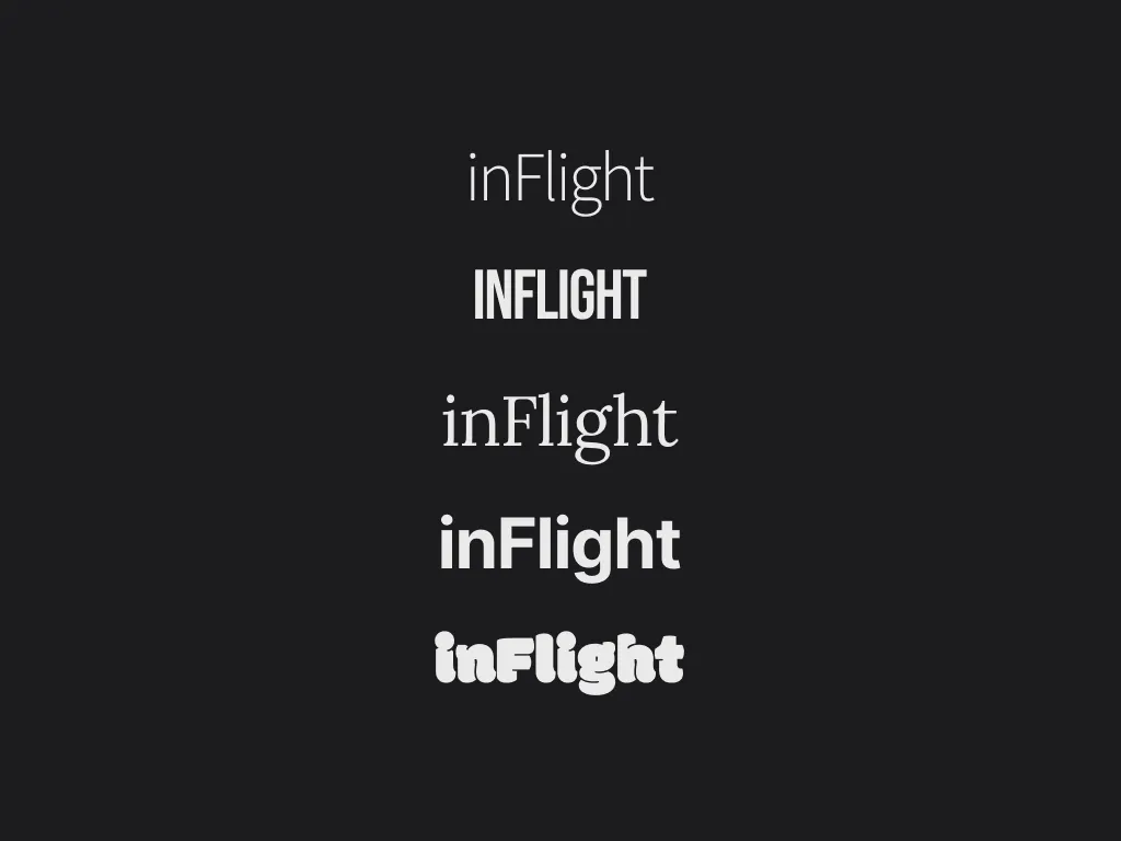
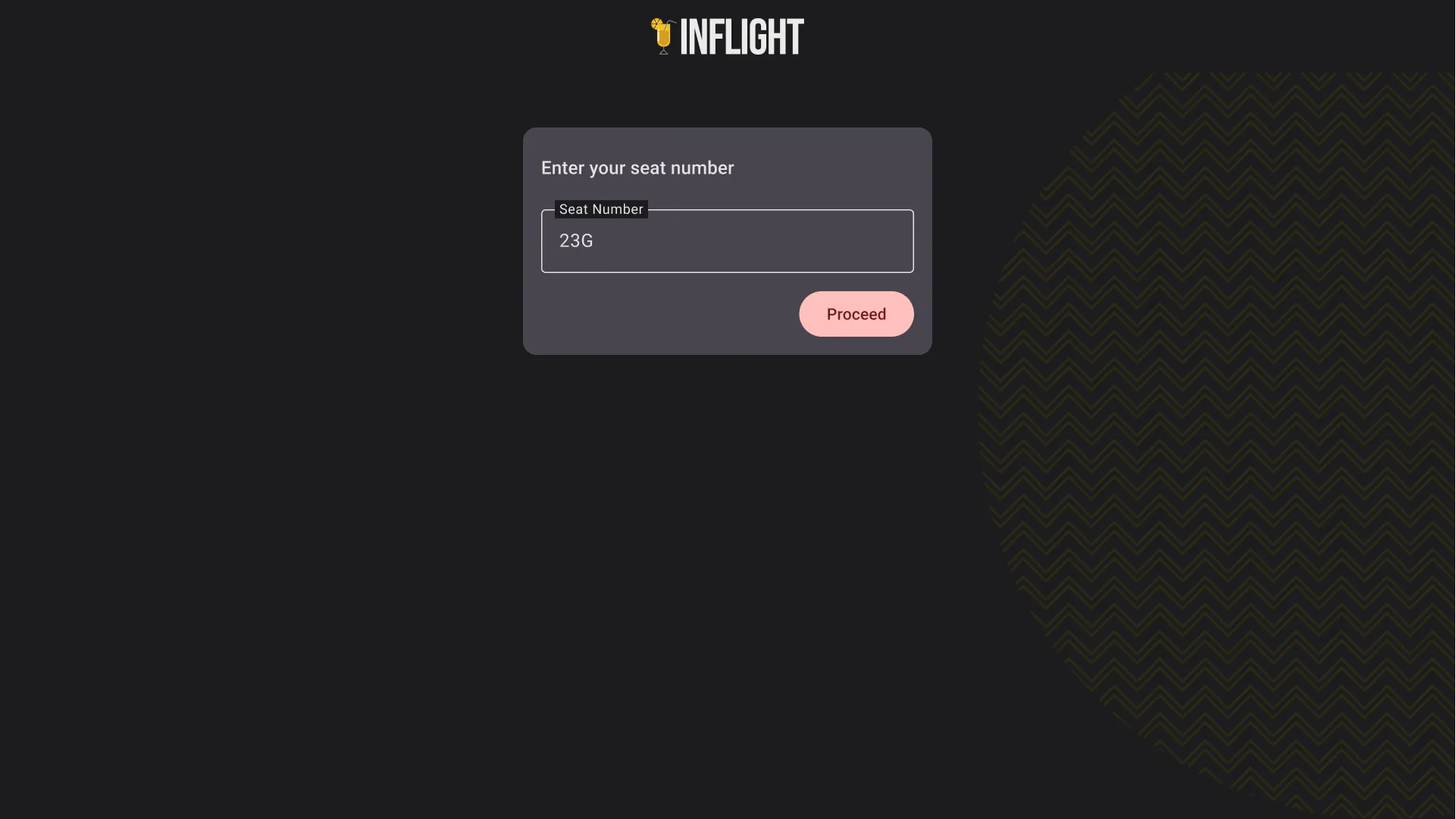
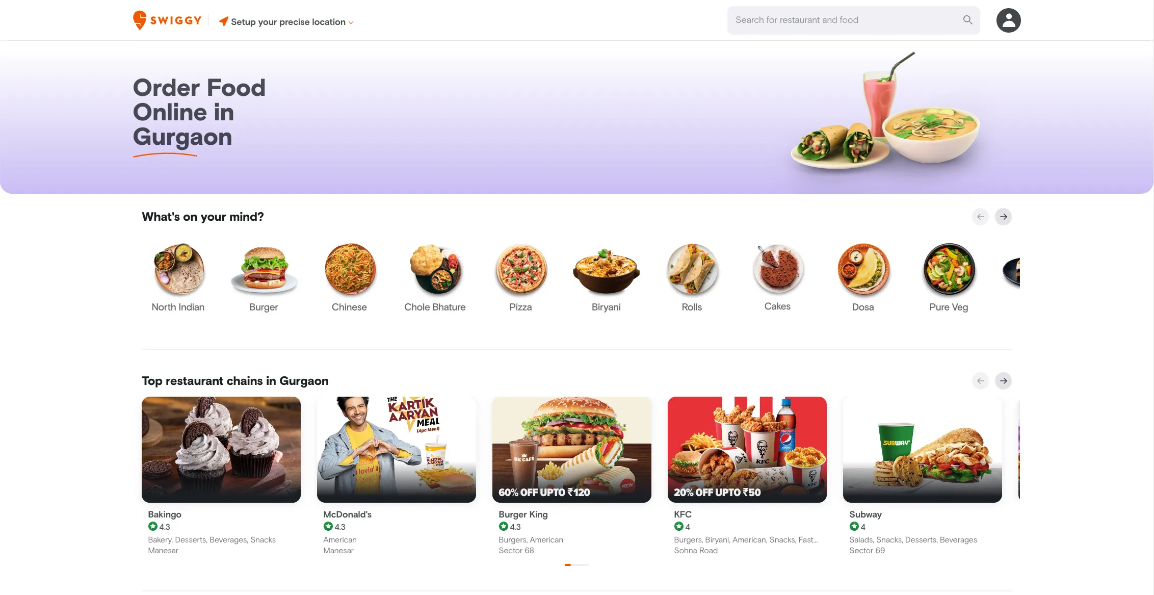
Based on the above existing designs and the basics of layouts, I drew the following wireframes for the layout

A wireframe with a persistent sidebar and a large hero section.

Always-on sidebar with hero section: This could be beneficial if the service needs space to upsell, add more white space, or information. It seems like this approach will not be needed due to the limited options available. Furthermore, there is little need to establish the context in this case and it would be beneficial if ordering was free of friction.

A wireframe with no navigation.

No navigation: This simply shows the user all options. This is a naive approach and may need more structure.

A wireframe with a sidebar for categories, similar to a modern McDonald's self-serve.

Always-on sidebar for categories: This approach is similar to the self-help kiosks used by McDonald’s. It has a small side navigation to categorize the available options. This approach seems ideal for this type of display.