Ordering food in flights
Introduction
This project was part of a design assignment given to me when I was applying to Crib. Usually, I don’t do take home assignments but the problem was interesting and I made it clear that I won’t be working more than 2 hours on it. The following is the document I submitted to them.
Ideation
Goal
To be able to order food for consumption on a flight.
Agenda
- To write down all possible ideas to allow me or other passengers to order food while on the flight.
- To filter out ideas from all the ideas that are realistic and viable.
Ideas
The following ideas were recorded in a 10-minute brainstorming session:
- A steward can ‘wait’ for the passengers to order and be available throughout the flight.
- Use alert buttons on the seat to call a steward, and tell them you want food delivered.
- The passenger can speak out their order into a microphone and the orders can be processed using speech models automatically.
- The passenger could walk to a place designated to order food whenever they like and order food by asking a human or ordering it using an electronic system.
- The flight could have telepathic sensors and could automatically deliver food to the passenger when they are hungry.
Constraints
The problem space seems to have the following constraints:
- Commercial flights available to the general public have protocols and mandates to follow which disallow the tray tables to be open for a portion of flights.
- Larger meals are served on trays which are safely carried in carts, which can only be used a fixed number of times depending on the duration of the flight.
- Flights are made to optimize maximum seating space for passengers leading to cramped walkways and minimal crew. This is a measure to maximize profits made on each trip.
Reflections
-
A steward can ‘wait’ for the passengers to order and be available throughout the flight. Stewards cannot wait idly for the passengers due to space and time constraints.
-
Use alert buttons on the seat to call a steward, and tell them you want food delivered. Alert buttons present on each seat are already present and are used to summon stewards. However, doing this for each passenger can lead to a lot of chaos and will surely make things difficult for the already limited staff on the plane. This is probably another reason why fixed timings work best on the flight.
-
The passenger can speak out their order into a microphone and the orders can be processed using speech models automatically. This would imply that the ordering is done using a conversational user interface. Similar to a voice assistant like Siri, or Alexa, this can be especially useful to passengers with situational or lifetime disabilities. The drawbacks to this method are that it could cause a lot of noise when ordering depending on the input devices used for communicating with the user interface (microphone sensitivity).
-
The passenger could walk to a place designated to order food whenever they like and order food by asking a human or ordering it using an electronic system. Due to constraints in space, the flight is unlikely to have a kitchen or play for a vending machine where queues could be formed. This can also cause issues
-
The flight could have telepathic sensors and could automatically deliver food to the passenger when they are hungry. The current technological complexity disallows us to make this work. If and when this is possible, I would like to believe there could be a two-way conversation between the computer running the telepathic sensors and the passenger. This would allow the passenger to know possible options, and confirm selections. I can imagine it to be similar to the conversational user interface described in 3.
Summary
Of the above ideas, the use of a microphone on an electronic device to order food is feasible. Alongside this, we could use methods like SCAMPER to ideate based on the current methods that are used to order food on commercial flights.
Due to the drawbacks of the conversational user interface, we could Combine the application to have a visual interface for users without having to use a microphone or electronic device for audio input.
The ability to pick seat numbers may or may not be retained. This is because a single user might want to order for their family or co-passengers. If retained, the process to pick another seat must be modelled.
Requirement Engineering
Goal
To anticipate tangible requirements to build an application that allows flight passengers to electronically order food using a device that uses vocal commands and optionally a visual user interface.
Information
For a user to be able to order food in-flight, the following information is required by the application:
- Seat number or Booking number and passenger name – Used to determine where the food is to be delivered. I think, of the two, just asking for the seat number will lead to lesser friction.
- Food inventory – Since rations are limited, this will be used to display the availability of items to users, essentially, representing the state of the current inventory in real time.
- Food item details – Nutritional information, price.
- Timings for serving food – It is important for the application to know if food can be ordered to be consumed immediately, at a scheduled service later, or not at all.
- Payment information – In case the ordered items are not free of cost, payment information is important.
Devices
In-flight displays
These can be controlled using touch, physical buttons, or vocal commands.
Pros
- Remove the need for the user to input the seat number because the seat number will be pre-determined.
- They are also controlled environments specifically meant for in-flight activities and are relatively free from distractions and exploitation.
- These are assured to use the application correctly unlike the user’s own devices which could have several issues.
- These allow passengers to access the application, including those who do not have their own electronic devices to access the application.
Cons
- It can be expensive to install and maintain in-flight displays.
Smartphones and Laptops
These can be controlled using touch, physical buttons, or vocal commands.
Pros
- Prevents the need to install and maintain in-flight displays and saves costs.
Cons
- Passengers need to enter their seat number to start ordering.
- Passengers will be reluctant to share smartphones/laptops to order food for other passengers who do not have access to a smartphone. This is because smartphones are considered personal belongings.
- Passengers with no access to a smartphone/laptop or limited knowledge of using their phone will be forced to either speak to a steward or ask co-passengers for help.
- Passengers with no access to a smartphone will be reluctant to ask for a stranger’s smartphone because they can be misled or cheated when providing payment information.
Conclusion
It seems like in-flight displays are the ideal device to use this application on. The usage of smartphones and laptops can make the ordering experience exclusive.
Wireframing
Inspiration
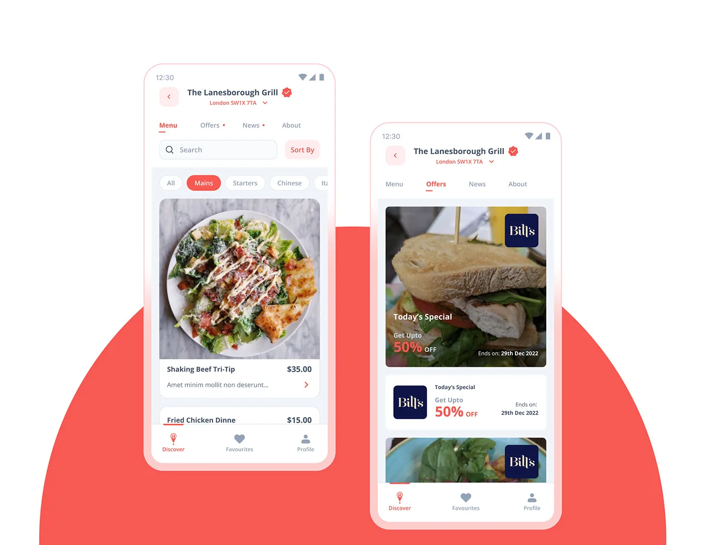
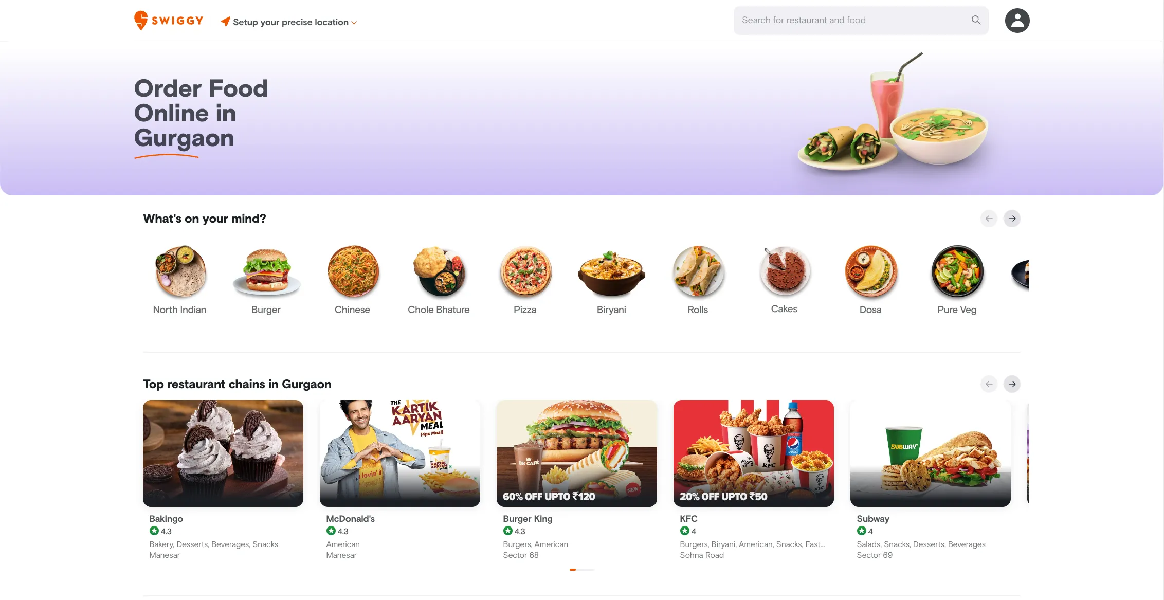
Wireframes
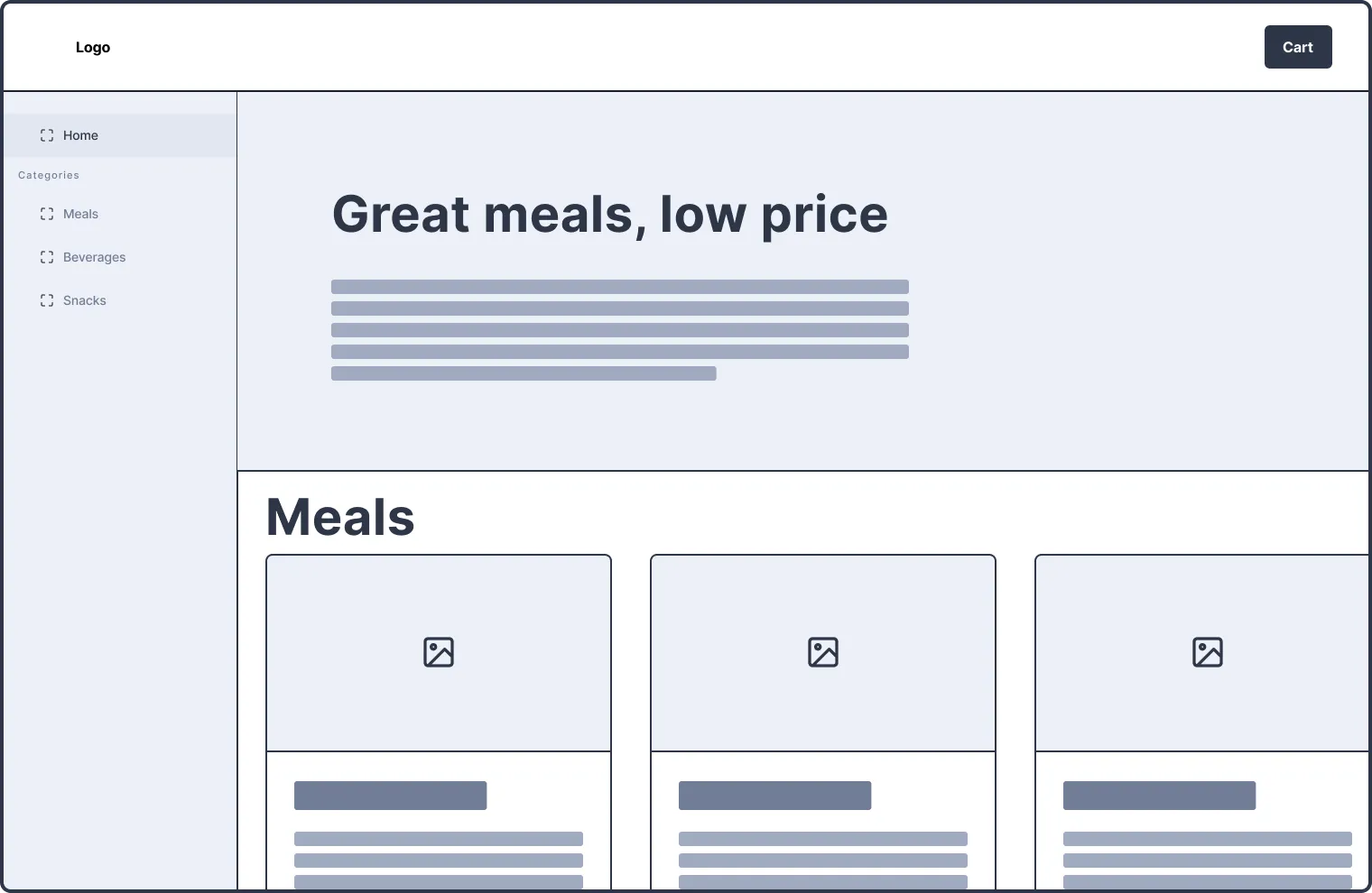
Always-on sidebar with hero section: This could be beneficial if the service needs space to upsell, add more white space, or information. It seems like this approach will not be needed due to the limited options available. Furthermore, there is little need to establish the context in this case and it would be beneficial if ordering was free of friction.
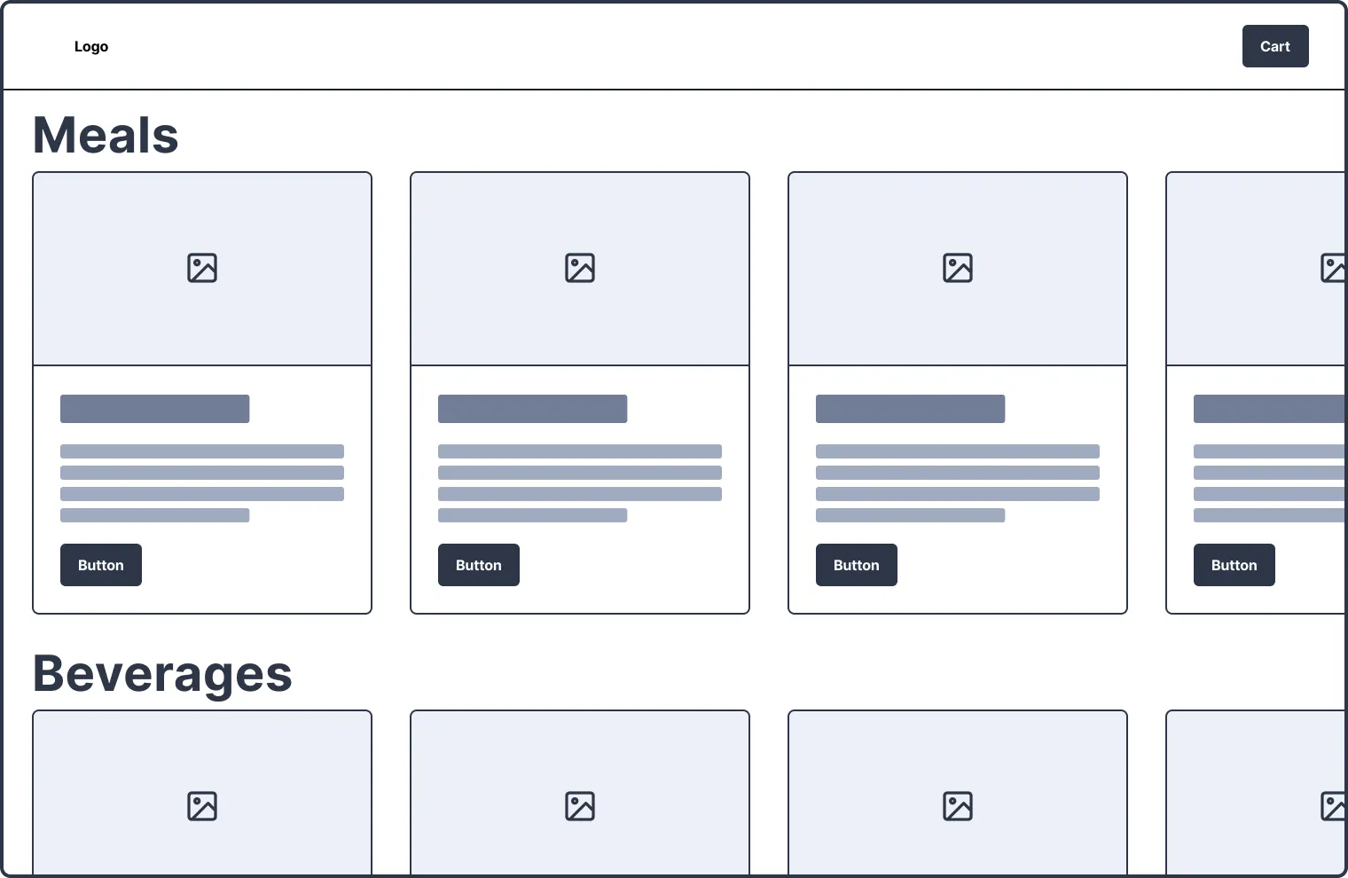
No navigation: This simply shows the user all options. This is a naive approach and may need more structure.
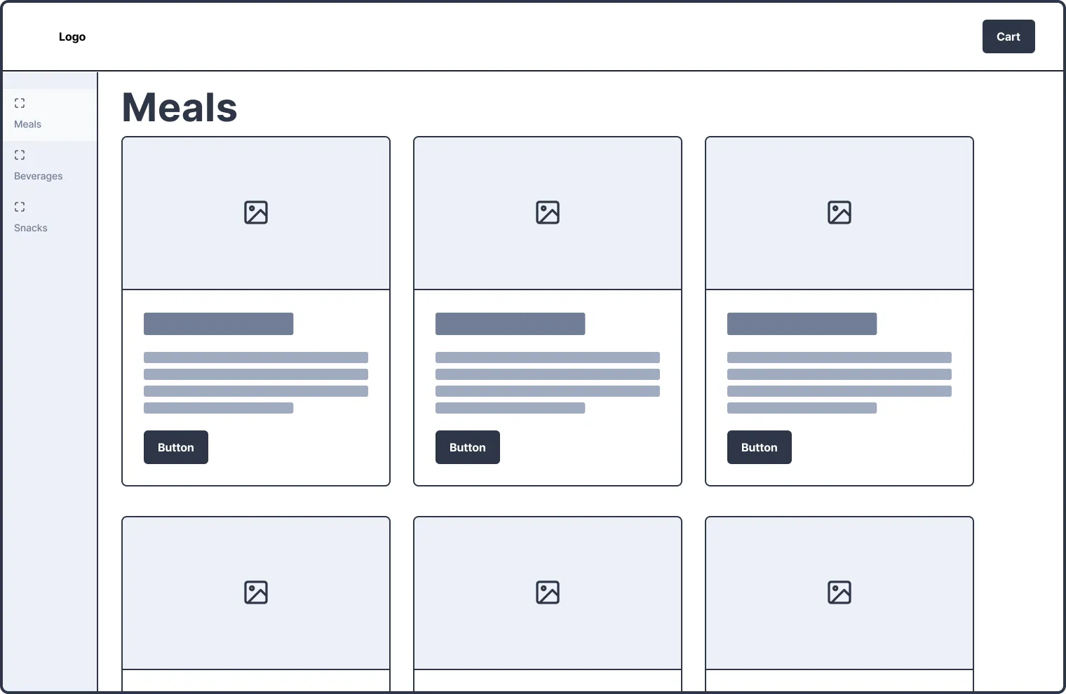
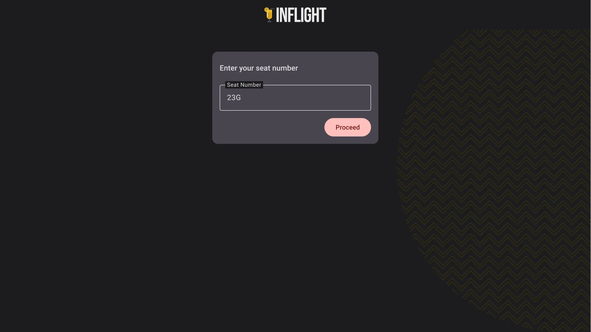
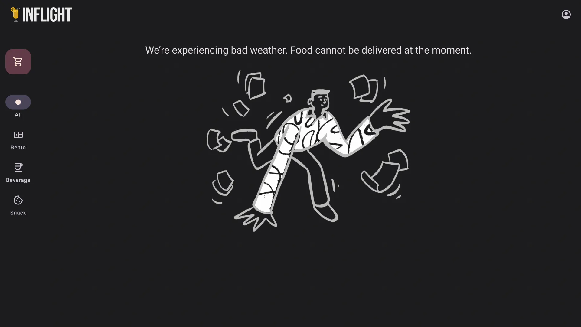
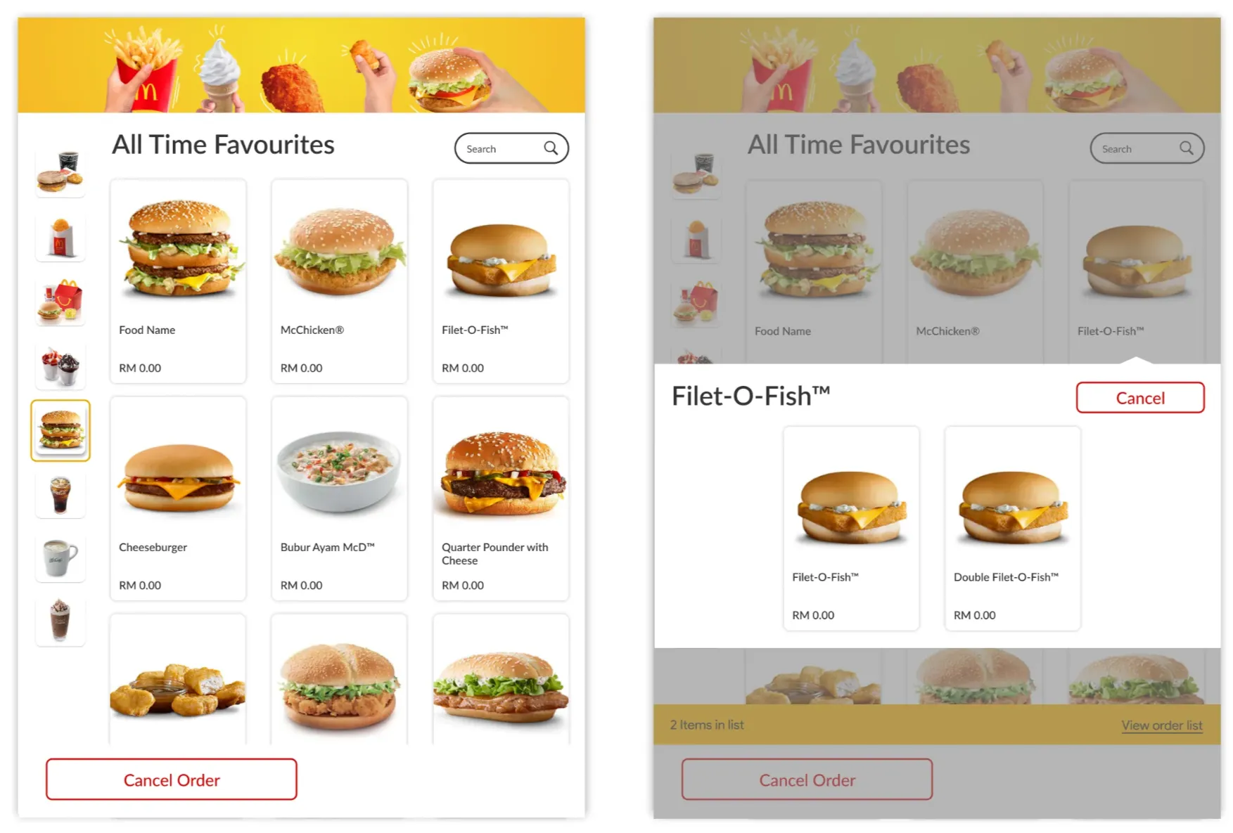
Always-on sidebar for categories: This approach is similar to the self-help kiosks used by McDonald’s. It has a small side navigation to categorize the available options. This approach seems ideal for this type of display.
Prototyping
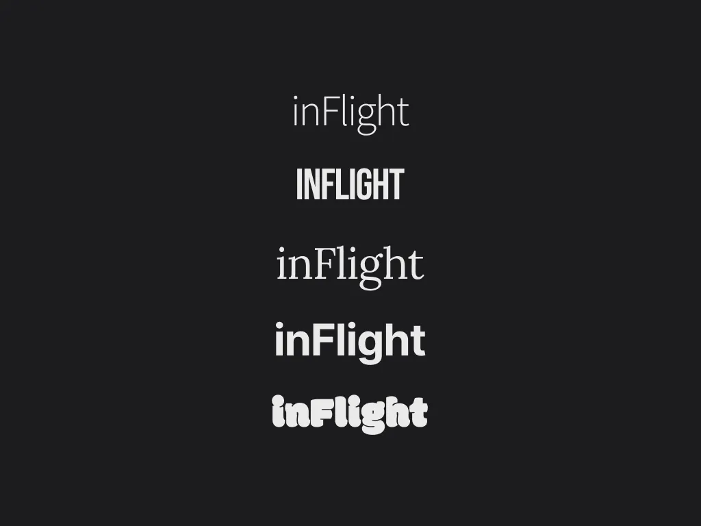
I quickly iterated over a few potential logo types that could be suitable for the applicaiton. Afterward, I made a copy of the Material Design 3 component library in Figma and started to build mockups based on the wireframe that I had selected. I built a simple login flow with a splash screen and an empty state because I was low on time and I had to be true to myself and not spend more than 2 hours.