We rewrote an Angular application in Angular
Why rewrite?
Cryptlex is software licensing service that independent software vendors (ISV) embed into their software to enforce entitlements in their software. Cryptlex’s web applications primarily serves three audiences:
- Managers and developers at the ISV
- Resellers of the software
- Customers who have bought software from the ISV
The above users have diverse needs that are often disjoint. The existing Angular SPA had a lot of botched if-elses to accomodate the above mentioned users. However, as we started shipping new features more frequently it became difficult to maintain the application for all three user personas when the feature could be affecting just one persona.
The existing application also contained a lot of technical debt. We decided to rewrite the application in phases and split the application into three applications, the admin-portal, reseller-portal, and customer-portal.
Why Angular?
The CTO and the frontend engineers have been working with Angular since the start and wanted to continue using the framework.
I made the decision to stick to prototyping directly in code instead of creating an abstraction in Figma due to the small size of the team. However, I was still quite keen on finding effective ways to document design decisions.
So it was established that we will build three Angular applications, and a component library that is shared across the three. We decided to base the user interfaces on the Material Design spec since I was fairly familiar with all iterations of the specification and consider it to be mature specification for building mobile-first applications.
Similar to IBM’s design system Carbon, I decided to scope the components for web applications separately from the components for marketing websites since the two served somewhat different purposes and to band-aid the two was bound to cause complexity in some areas. However, more than anything else, I pushed this because I found Angular to be impractical for a variety of marketing use-cases.
The woes of using Angular
Angular Material still follows older Material specifications
Despite Google’s design team parting ways with the underline input field, all caps text in buttons, and many other design flaws in the design specification, a large portion of the library has not evolved past these issues. This forced me to start with creating a custom button, tabs, and stepper component.
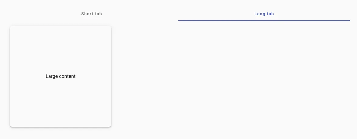
The default tabs have translucent buttons on the tabs with inadequate affordances. These buttons were proposed to work with all caps, which is no longer acceptable by the design system.
My implementation of the tabs aims to represent the active state better. Icons are made mandatory to support the button transparency, and the underline serves as an additional affordance.
It took quite a lot of elbow grease to allow the component to look for error states in the form and navigate to the tab/step with the error. It is still an open ticket in our project to implement a way to scroll down to the field with the error after navigating to the tab/step with the error.
Angular Material isn’t a great library to build UIs on
Angular Material contains a decent set of components to build applications and a component development kit (CDK) to build custom components. However, the styling system based on SCSS variables is dated and implementing something like a dark mode switch, which is considered trivial in modern CSS with variables, is not very straightforward. This also affected the development of a colour customization system for the reseller-portal and the customer-portal.
To be fair, the developers of Angular Material discourage overriding styles but this makes it difficult to leave the door open for the library to be themed to fit the brand image in the future.
The Angular Roadmap does mention the following, which is a change to look forward to.
To provide better customization of our Angular Material components and enable Material 3 capabilities, we’ll be collaborating with Google’s Material Design team on defining token-based theming APIs. As of Q4 2023, we’re refactoring components to use the new API, finalizing the comprehensive set of tokens, and updating the Sass API based on the new tokens.
Angular doesn’t have mature libraries to build UIs on
In a team as small as Cryptlex, getting things done right and getting things done fast are both high priority objectives. Both the Angular CDK and spartan.ng can be thought of as headless UI libraries which can be used to build your own custom components. However, the functionality that they provide is quite basic when compared to projects like Bits UI for Svelte, and Radix UI for React.
Alternatively, instead of Angular Material and the CDK, we could have use a larger component library like PrimeNG or NGZORRO. However, both of them fall short in ways similar to Angular Material. They cannot be customized to fit a certain visual language and building custom components is not supported. PrimeNG does show promise with their move toward better theming.
Tooling for Angular libraries is dated
Angular libraries do not support PostCSS which would prevent us from using TailwindCSS, which the team has grown very fond of. On top of this, using Angular libraries with npm workspaces turned out to be a bit of a struggle so we had to co-locate the project using Nx which provides adequate tooling to build an Angular library that can be reused while still using PostCSS, and as an extension, TailwindCSS. I’m not a critic of bundlers but having a build system felt like overkill for something like this.
Storybook doesn’t quite work
I am very drawn to the paradigm of UI development that Storybook brings to the table. It also allows documentation to live closer to the developer which is one of the goals I wanted to achieve with this rewrite. However, to my disappointment, it is not very well supported in Angular.
Forms aren’t truly declarative
Angular is known for being a batteries included framework and it has been praised for having a declarative form library called ReactiveForms similar to Formik inbuilt. Consider the following comparisons between form handling in React and Angular:
const SignupSchema = Yup.object().shape({
    preferredName: Yup.string()
        .required('We require your name for legal purposes'),
    email: Yup.string().email('Invalid email').required('We require your email in this step.'),
});
form = this.formBuilder.group({
    preferredName: ["", [Validators.required]],
    email: ["", [Validators.required, Validators.email]]
})
    <mat-error *ngIf="form.get("email")?.errors?.['required']">Your email is required.</mat-error>
    <mat-error *ngIf="form.get("preferredName")?.errors?.['email']">Email is invalid.</mat-error>
    const schema = yup.object().shape({
                    showEmail: yup.boolean(),
                    email: yup.string().email()
                        .when("showEmail", {
                            is: true,
                            then: yup.string().required("Must enter email address")
                        })
                    })
    static emailForm: ValidatorFn = (formGroup: AbstractControl) => {
        if (formGroup instanceof FormGroup) {
            const showEmailControl = formGroup.get('showEmail');
            const emailControl = formGroup.get('email');

            if (showEmailControl?.value === true) {
                email?.setValidators([Validators.required]);
            } else {
                email?.setValidators(null);
            }
        } else {
            return null;
        }
    }
Was it worth it?
We expect an increase in product awareness with the newer navigation bars. The information hierarchy has better semantics and aims to showcase the product’s capabilities better.
The older navigation made less semantic sense when trying to explain hierarchies in the service.
With adequate signalling of error states on tabs and inputs, previously unavailable, we expect better completion rates.
I implemented a new colour customization feature with the revamped styling architecture, and defined a uniform structure for services that helped us build faster and do cache-invalidation reliably.
Overall, we observed a significant decrease in development time with the new applications.
What would I do differently today?
Small startups like Cryptlex usually have quick iteration cycles and require a certain speed of work to achieve them. With this in mind, it is always great to have an extendable set of visually consistent components to start with.
All frameworks that I have used so far have their idiosyncrasies. In my time writing React, I can say that it is equally difficult to understand and work with the framework (read useEffect) as it is with Angular (read ControlValueAccessor, NgTemplateOutlet).
However, React has a rich ecosystem of libraries like shadcn/ui and Tanstack Table that make it easier to build UIs with it. If I was building today, I would probably pick React, or Svelte, despite their set of limitations and issues.